伊良湖岬灯台は恋のパワースポットです。
恋路ヶ浜で恋がかなう鍵をかければ、恋愛成就って、みんなどれだけ、錠をかけるんだろうとツッコミどころも満載ですが、恋に鍵は必要らしい・・・。
どうも私はそういうのは苦手ですね。
一緒にお祈りできれば、その鍵の形にしたくない派です。
(私も相当こだわりがあるかもしれませんね)
日出の石門も眺めがとても素敵ですね。
ここもおすすめです。
蔵王山展望台にいけば、渥美半島が見渡せるすてきな夜景スポットです。
イルミネーションもあるみたいですよ。
なんと4000球!
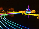
とはいえ、もっとも?近いのは三重県のなばなの里のイルミネーション。
今回は日本の四季をイメージしているので、色が変わります。
ここは水面イルミネーションをやっていて、日本唯一なんだそうです。
こんなに近くにあるんだから、出かける価値ありですよ!
|